Hanging loose this mid-day Sunday here in California’s Central Valley — another inside day with rain and more rain.
I wanted to share this since last week, but never got around to it.
Recalls the days of actual physical print media and the typeface design of the world of reading, books, and magazines, in fact before the InterWebs and social media shifted shit from on the page to the ether. (h/t Miss Cellania):
Fonts hanging out pic.twitter.com/rXUzNNlQp7
— Elle Cordova (@ellerhymes) January 23, 2024
In my day, ‘Comic Sans‘ was my way-most-favorite — it was just so freaking cool looking.
And although the font became a hated type on the InterWebs (“Not great for communicating with other adults“), I thought it was pitch-perfect for headlines and seemed to inspire smiles and laughter.
A noted response:
For starters, Comic Sans, created by type designer Vincent Connare in 1994, is designed to be disambiguous — that is, every letter is unique. Letters like b and d, or p and q, aren’t simply mirror images of each other, unlike in more regular fonts such as Arial. While emulating a handwritten feel, it also means those with reading difficulties can distinguish individual letters easily.
A fantastic piece by AIGA Eye on Design says it better than I can, and the fact the British Dyslexia Association recommends Comic Sans in their style guides for dyslexia-friendly text speaks for itself. Vloggers VSauce also have a fantastic video on the subject.
One may argue that the point of fonts is to be readable (Wingdings and other dingbat fonts excluded, of course), and in this way Comic Sans goes above and beyond. The irregularity of its composition and the variation in letter height make it particularly readable for those who suffer from reading difficulties.
Comic Sans was also part of a study by Princeton University which showed that the font could literally improve your memory. The study tested how the readability of fonts affected schoolchildrens’ retention of information, and Comic Sans was part of an irregular font set used; the regular font set included Arial and Helvetica.
Further on fonts formatting on the hang:
Fonts hanging out pt 2 pic.twitter.com/2hRvAOTzF8
— Elle Cordova (@ellerhymes) January 29, 2024
Each to their own. However, ‘Comic Sans‘ history is memory: ‘The underlying cause for such derision is, ultimately, the font’s widespread use and, arguably, misuse. If Comic Sans stayed in its lane and only appeared on kid-oriented materials, there would likely be impassioned slurs on the subject. Yet, here we are. Thanks to the wave of 90s-era personal desktop publishing (creating banners in Microsoft Word, printing your own flyers, etc.), the power to chose a font was suddenly very much with the people. Once a decision reserved for studied designers, anyone with a weakness for cute could now choose Comic Sans as their weapon of choice. And so the world suffered the consequences.‘
And in that souvenir of thought:
Comic, or not, yet once again here we are…
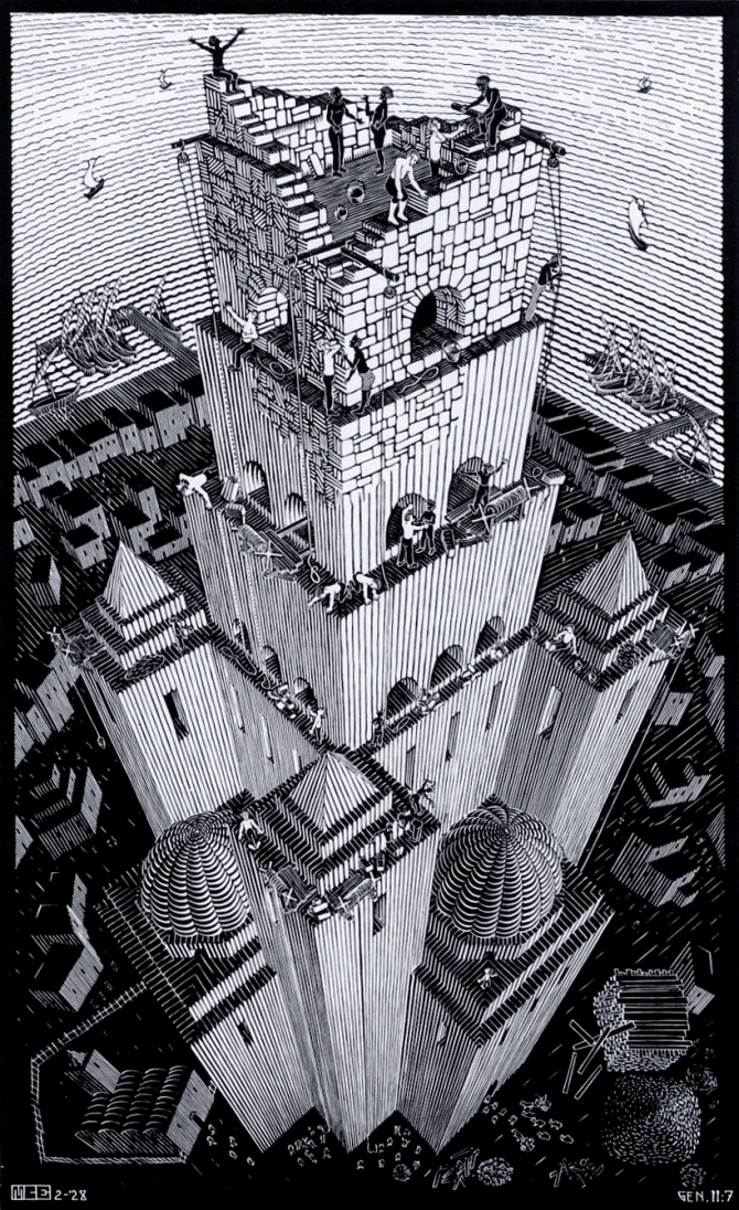
 (Illustration out front: MC Escher’s woodcut, ‘Tower of Babel,’ and found here.)